6 hours ago
Create a modern, professional mobile finance tracker dashboard UI inspired by premium finance apps (Audit-style). Design principles: - Clean, minimal, data-first layout - White cards on light gray background - Rounded corners (16dp) - Soft shadows - No gradients, no flashy animations - Focus on readability of numbers Screen size: - Mobile (Android) - Portrait - 1080 × 2400 Dashboard layout: 1. Header section - Text: “Hello” - Subtext: “Good Morning” - Notification bell icon aligned to the right - No heavy app bar 2. Total Balance Card - Large card at the top - Title: “Total Balance” - Large amount text: ₹12,540.00 - Two values below: - Income: ₹20,000 (green) - Expense: ₹7,460 (red) 3. Accounts section - Title: “Accounts” - Horizontal scroll cards - Three cards: - Cash – ₹2,340 - Bank – ₹10,200 - Credit Card – -₹1,000 - Same card style, consistent spacing 4. Spending Overview section - Title: “Spending Overview” - Pie chart inside a card - Legend on the right: - Food – 35% - Transport – 20% - Bills – 25% - Others – 20% 5. Recent Transactions section - Title: “Recent Transactions” - “View all” link on the right - Transaction rows: - Food – Today – -₹120 (red) - Transport – Feb 1 – -₹40 (red) - Salary – Feb 1 – +₹20,000 (green) - Each row: - Category icon on the left - Title + date - Amount aligned right 6. Floating Action Button - Circular FAB - Bottom-right - Plus (+) icon - Primary color Styling: - Primary color: Indigo / Blue - Background: Light gray - Cards: White - Text: Dark gray / black - Icons: Simple, minimal Output: - Single dashboard screen - Clean wireframe-style UI - Ready for implementation in React Native
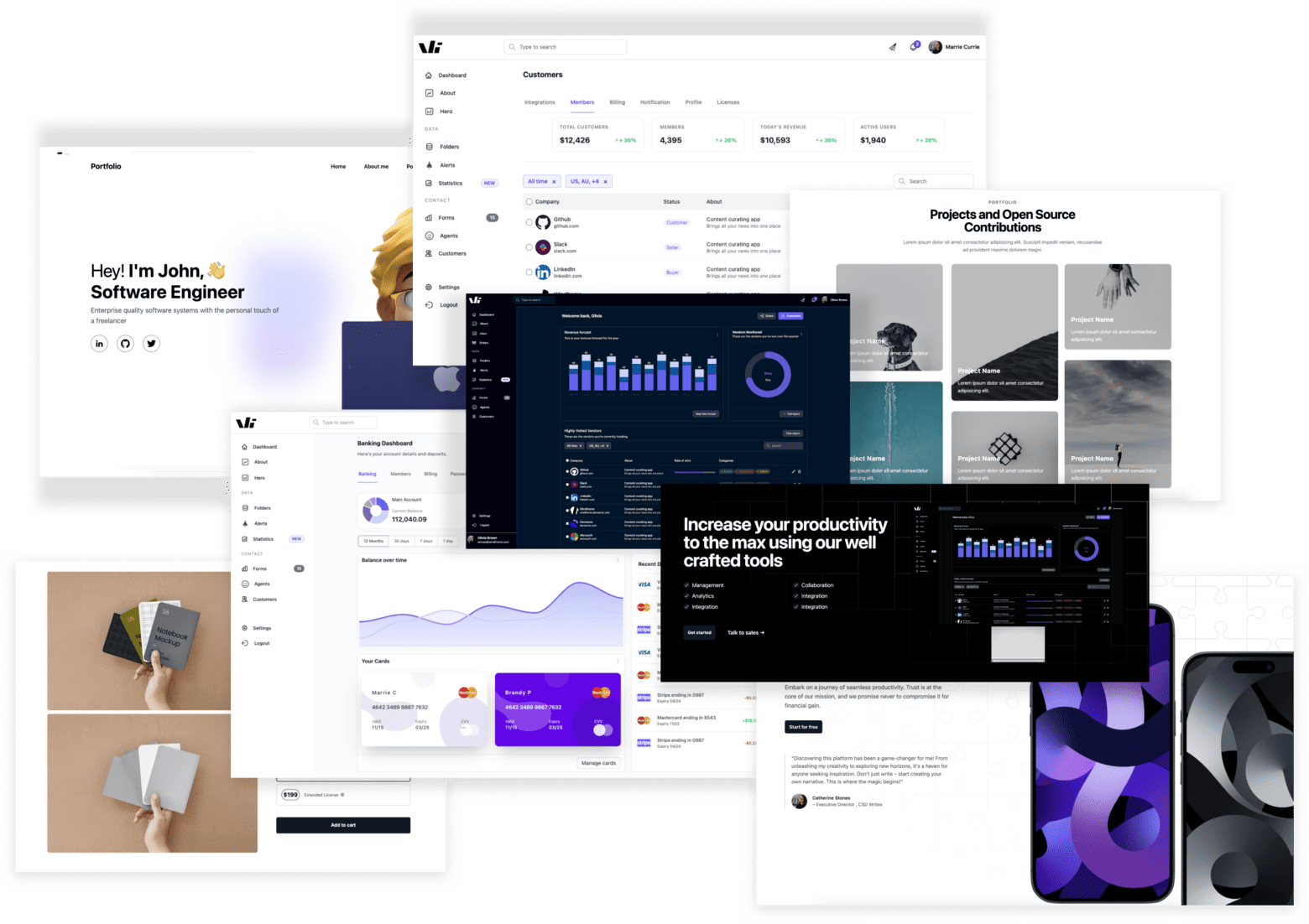
Windframe is an AI visual editor for rapidly building stunning web UIs & websites
Start building stunning web UIs & websites!
